
Let’s go back in time. Way back to 1997. Apple’s high-flying identity as a tech innovator had been seriously tarnished. It certainly wasn’t the global tech giant it is today, with a massive, loyal customer base and an iconic brand image.
Actually, Apple was struggling so badly that it had only 90 days of cash remaining in the bank. And that’s when Steve Jobs turned the Titanic around by asking this tough, strategic question: “Who is Apple and where do we fit into this world?”
After some serious soul-searching, the company reduced its product line and launched a groundbreaking ad campaign: Think different.
This campaign was so successful it continued for five years, returning Apple to profitability and reestablishing Apple as a brand juggernaut. In fact, Apple won the Grand Effie Award in 2000 for the most effective advertising campaign in America.
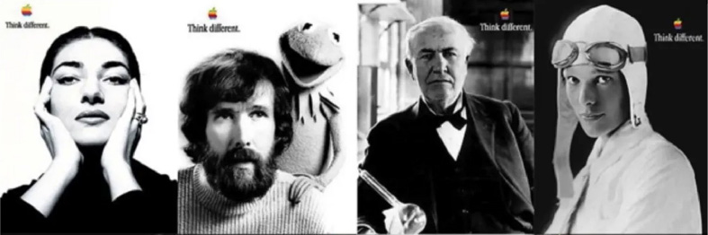
What stood out about this campaign? Aside from the beautiful black and white photos of legendary “crazy ones,” it made technology feel personal and exciting. Apple customers wanted to join this tribe of crazy ones because they could relate.
During times of change, we tend to focus on facts and figures. Apple could have easily taken that approach by listing its products’ technical specifications. But Steve Jobs knew he had to think differently. He had to build an emotional connection with Apple’s audience.
What can we learn from this story? As internal communicators, let’s look at what happens when you pull emotional threads as you communicate about change within an organization.
Change communication: A step-by-step scenario
 I’d like to introduce you to John, a fictional internal communicator. He works at a large pharmaceutical company and is gearing up for a massive company transformation — a new strategy that will change the way employees work.
John is tasked with getting employees on board and excited. Just as Steve Jobs did, John understands that the emotional aspect of organizational change is just as important as helping people understand the details. To help employees feel more deeply connected with this change, he decides to emphasize imagery and visual design.
Here’s John’s creative journey and the advice we would give him at each stage in the process:
Stage 1: Kickoff
The challenge: Before jumping into design, John needs to align with broader objectives so he can define what communication about this transformation should accomplish. He has a group of stakeholders to consider, but first, he needs to achieve consensus on what employees should know, feel, and do as a result of this transformation process.
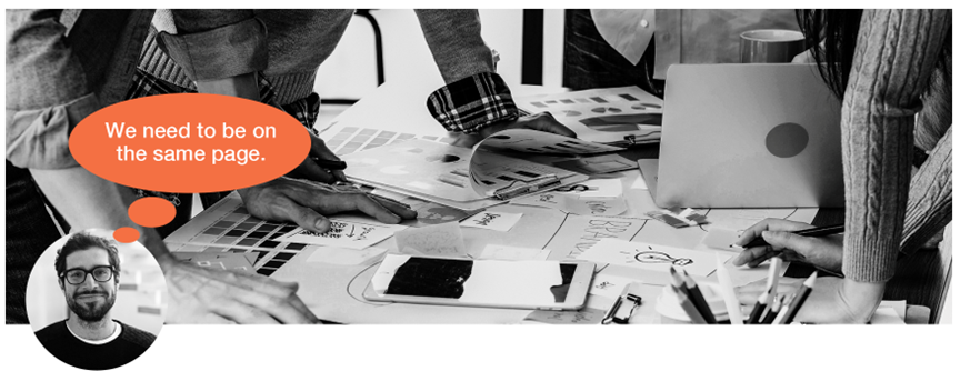
Our advice: The best way to align on an end goal is to bring all key players together. That could include leaders, project owners, change and/or communication teams, and cross-functional partners such as IT and HR.
To discuss, collaborate, and agree on objectives, design a meeting around these important questions:
- How does the change impact employees?
- What do employees need to know about this change?
- How should employees feel about this transformation before, during, and after?
- What do employees need to do differently to ensure this change is successful?
Answers to these questions will shape communication objectives. Once these priorities are clear, John is ready to consider how visual communication will help the message resonate with employees and showcase the change. (For example, visual elements may include a campaign logo and tagline, imagery or photo styles, type treatments, supplemental art, and other details.)
What would Steve Jobs do? Treat employees like customers. Explore who they are, what their work context is, and what kind of symbols and messaging are most likely to engage, persuade, and motivate them.
Stage 2: Creating the visuals
The challenge: John wants employees to connect to the transformation, and he knows a visual identity can accomplish that and more. He sets out to ensure the transformation feels relevant, familiar, and personal, so it is easier to understand, internalize, and support.
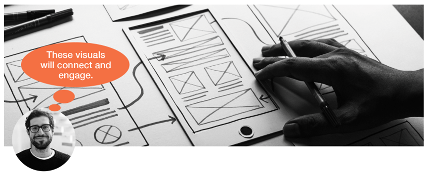
Our advice: Visuals can help you attract attention, influence perceptions, and leave a lasting, meaningful impression. Here are three ways to get there:
- Share the change story — Because stories influence how we feel about change, they are the antidote to facts and figures. Layer on images and you can offer a more accessible way to bring big concepts to life. Think of these images as shortcuts that help employees understand what’s happening, why it’s happening, and why it’s important for them.
- Make communication recognizable — Because change initiatives are usually one of many other things happening within an organization, communication needs to stand out and be easy for employees to identify. By consistently leveraging custom graphics, a distinctive logo, and a punchy tagline, your materials can break through the noise and invite employees to engage.
- Break down complex topics — The human brain processes visual cues 60,000 times faster than written language. Put another way, highly visual communication makes it easier for employees to consume information and retain it. For example, illustrating a new process or using icons to break down a strategy can build knowledge and reinforce actions.
What would Steve Jobs do? Turn brainstorming on its head. Instead of spitballing words, draw illustrations or curate visuals. This exercise will pinpoint the emotion and tone you want to represent throughout your change communications. Use these ideas to focus on creating simple, memorable visuals.
Stage 3: Making it stick
The challenge: John knows that successful change communication depends on how well you prepare people who are responsible for sharing critical information. Everyone needs to understand which materials and assets are available, why these visual tools have been developed, and how to use them.

Our advice: Consistency is key when it comes to communicating during change. A standard package of communication resources and recommendations helps all stakeholders deliver a consistent experience for employees. Here are three examples:
- User guide — This document (including imagery, logo, tagline, colors, and fonts) prepares people in communication roles by providing access to visual assets and specifying how they can be applied.
- Templates — These standard tools bring together various elements in a cohesive context. (This could include a PowerPoint deck, Word document, video opening/closing, logo/tagline files, digital signs, printed flyers/posters, and more).
- Communication plan — This playbook should explain when, where, why, and how to use each piece in the toolkit, and how they fit into the broader change process.
What would Steve Jobs do? Take the opportunity to express the importance of change tools by meeting with key stakeholders to reinforce the strategic objectives, explain how each element supports these goals, and answer questions about how to move forward.
 When using visuals to support change communication, it’s not just about sharing information. It’s about connecting with employees on a deeper level and making the change process meaningful to them. So the next time you’re tasked with a change campaign, ask yourself: How can I tap into employees’ emotions? What do I want this campaign to represent? How can I think differently?
Download our checklist: 3 steps to make change communication more visual
Get the at-a-glance version of our advice, so you’re ready to design communication differently. We included additional tips and tricks to help you get the most out of the creative process.
Originally published on talentculture

Christine
Burri
project director

Janice
Comes
art director

David
Pitre
CEO
David is responsible for the strategic direction of Davis & Company to ensure we’re delivering innovative solutions for our clients’ toughest internal communication challenges.