My daughter Samantha is getting ready to leave for her freshman year of college next month. This is the fun part: shopping for stuff to decorate her dorm room, getting to know her roommates and simply anticipating the new experience.
But flash back two years to when Samantha was just a high school junior and the path wasn’t so clear. My daughter had some idea of what she wanted in a college—a great art program and a location within a four-hour driving radius of home—but everything else was a mystery.
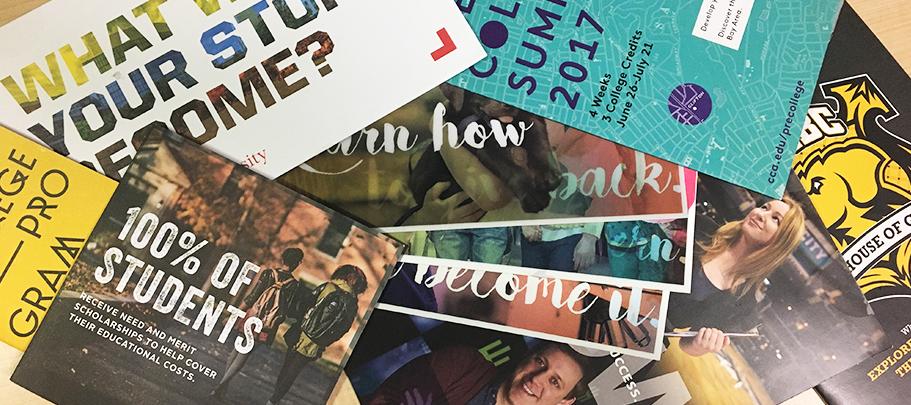
That’s when the college recruiting materials started arriving in our mailbox. Some we requested, but most arrived unsolicited. And what started out as a trickle—a postcard or two—quickly became an everyday stream of printed pieces in all shapes and sizes.
The Mom part of me organized all the pieces in a file box so we could refer to them as we explored potential schools. But the Art Director part of me analyzed the recruiting materials for how effectively each postcard or brochure was designed.
My verdict? Nearly every piece was eye-catching and intriguing. In fact, once Samantha had decided on a college, I saved a number of these materials in my Inspiration file to use when I need to design a print piece to communicate benefits or any other topic to employees.
Here are five design approaches from college recruiting pieces you can draw upon for your internal communication print materials:
1. Size does matter. Most print pieces come in just a few traditional sizes: 8 1/2"x 11", 11" x 17" or their folded variations. But the college materials used a wide variety of shapes and sizes: from small to medium to way too large for the mailbox! The result was these pieces not only stood out from the rest of the mail—each also invited you to pick it up, open the wafer seal and see what was inside this unusually sized package.
2. The story unfolds. Okay, I have a confession to make: I’m a geek about folding. In fact, I subscribe to the foldfactory.com “60-second fold of the week” so I can see interesting ways to fold print pieces. So the college recruiting materials were right up my alley. Some were set up as traditional booklets, but others unfolded in lots of interesting ways. As with interesting sizes, the effect was tactile—you wanted to play with the piece and see how it worked.
3. You’re just my type. The Arial typeface is so ubiquitous that sometimes it seems to be taking over the universe. (Sorry, Univers, but you’re so last century.) That’s why the array of typefaces on college recruiting materials stood out. For example, one piece used typography that looked like beautiful hand-painted calligraphy. Another featured a distressed edgy urban font. A third went for an elegant Art Nouveau typography. Just as I learned in art school, the choice of typography helped support the design theme of the piece.
4. Let’s get real. When designing for internal communication, we often use stock photography to show people. And, as every designer knows, stock photography is tricky because the people can be too perfect, their smiles too bright and the poses too staged. An effective technique used in the college pieces was to show real college students or graduates sharing their stories about why a particular school was the right choice for them. Showing faces is always an effective visual technique—and when the people are real, it’s even more compelling.
5. I’ve got your number. Although the college stuff was addressed to my daughter, I quickly realized that it was designed to appeal to her parents, too. After all, Samantha is a digital native who uses her smartphone to get information, while I’m more likely to engage with print. So each brochure or postcard contained data meant to answer my questions like: “How much does this school cost?” and “How many graduates get a job?” The data was designed in a very eye-catching way—including large, bold type, colorful charts and callouts that pop—that was never overwhelming and was always appealing.
I’ll bet you’re wondering whether all this mail worked; did my daughter go to one of the colleges that produced great design? The pieces definitely encouraged us to consider some schools that wouldn’t have been on our radar otherwise. And one of the universities that sent really good mail made it to the top of Samantha’s list. But ultimately, she made her decision based on old-fashioned criteria: She’s going to the college that offers the program that best fits her needs.